在组件库中封装element-plus - 自己撸组件库篇三
大家好,我是鸽鸽。
前面我们一起从零开始搭建了一个公共组件库,在公司有资源维护的情况下,造轮子无疑是自我提升和刷kpi的好方法。但实际上,封装第三方组件库并添加公司的业务逻辑基本上就够用了。
本篇文章我们在之前的组件库的基础上,封装element-plus的el-input组件,一起了解二次封装的要点和技巧。
相关代码在这 learn-create-compoents-lib/class3,建议搭配食用
系列文章
《搭建vue3 & ts组件库脚手架 - 自己撸组件库篇一》
《组件库版本的管理和发布 - 自己撸组件库篇二》
《在组件库中封装element-plus - 自己撸组件库篇三》
安装element-plus
正常情况下,我们的项目中会安装有自己的element-plus版本。如果再将element-plus安装到组件库的话,那么项目安装依赖时会下载多个element-plus的版本。
实际上我们希望的是组件库能够使用项目的element-plus版本即可。
在这种情况下可以使用package.json的peerDependencies来声明外部依赖。
我们在组件库的 package.json 里添加声明
1 | // /packages/components/package.json |
然后我们在测试项目也就是根目录的package.json文件中安装element-plus
1 | // /package.json |
配置都写好后,使用 pnpm install 进行安装
修改项目打包配置
排除打包依赖
在之前的文章中,我们在打包时排除了vue依赖。这里也一样,我们要排除element-plus有关的依赖,在组件库的vite.config.ts中进行修改
1 | // /packages/components/vite.config.ts |
其中@element-plus/icons-vue是element-plus图标相关的依赖
排除掉 scss是因为我们要在组件中引入element-plus的样式,但是这个样式也要从外部项目的element-plus依赖中获取
为什么是scss而不是css呢?
因为在项目内通常会定制化element-plus的样式,这都是通过修改element-plus的scss变量来完成的。如果想定制的样式能影响封装在我们组件库中element-plus组件的话,后面在我们的组件也必须要引入element-plus的scss样式。
自动引入element-plus的样式
在编写我们组件库的组件时,需要使用按需加载的方式引入element-plus组件,如:
1 | <template> |
可以看到我们不仅要引入组件,还需要引入基础样式和组件样式,这个需要的element-plus组件变多的话,非常麻烦。
我们需要使用unplugin-element-plus帮助我们自动引入样式
安装unplugin-element-plus 到组件库的包下
1 | pnpm add unplugin-element-plus -D --filter components |
在vite配置文件里添加下面配置
1 | // /packages/components/vite.config.ts |
配置好后,编写组件时只用向下面这样就行
1 | <template> |
简单封装el-input组件
将之前封装好的gie-input中的input换成el-input组件,功能和之前一样,最终文件如下
1 | <template> |
运行打包和预览命令
1 | npm run build |
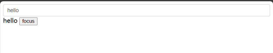
在浏览器中可以看到结果
将组件接入到el-form的表单校验
我们在组件库里封装的组件,大概分为3类。表单组件、数据展示组件和布局组件。
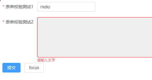
其中表单组件一般都会和element-plus里的el-form组件结合使用。假如我们自己封装一个富文本组件,当输入后失去焦点且字段要求必填时,会自动触发el-form的校验。此时需要显示错误提示和我们自己封装的富文本的边框变红,这应该如何实现呢?
首先我们需要在组件里获取到el-form-item组件的实例,element-plus暴露了一个contextKey,可以让我们方便的将el-form-item实例注入进来:
1 | <script setup lang="ts"> |
然后通过元素的blur事件调用校验方法:
1 | <template> |
可以看到上面validate方法的参数为blur,这个表示执行项目中规则的trigger为blur的校验。
1 | const rules = reactive<FormRules<RuleForm>>({ |
到这里错误提示可以在失去焦点并校验失败时自动显示出来,下面开始修改错误时的边框样式。
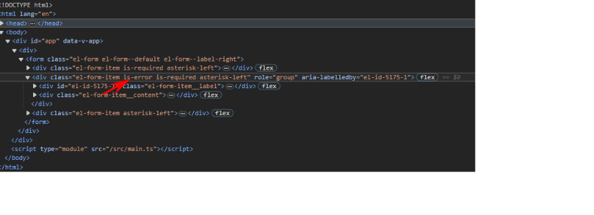
可以看到,当校验失败时,el-form-item上会加上is-error的class,我们只用通过class来修改边框即可
1 | .gie-richtext{ |
总结
本篇文章学习了通过peerDependencies安装element-plus,并在打包时将element-plus相关的包排除在外。封装element-plus,以及和el-form校验相结合。
到这里基本上组件库封装element-plus就完成了,以后再复杂的组件也只需要在这套脚手架项目上添砖加瓦即可。
以后有好的组件库编写技巧的话会继续分享的咕!
在组件库中封装element-plus - 自己撸组件库篇三